Google Play subscriptions
A platform for all
Google Play Store powers all Android devices around the world, allowing smartphone users to get apps, games, movies, books, and TV shows. I had the opportunity to work with the Subscriptions team as the lead UX Designer, working to help people discover, sign-up for, and manage subscription services offered by our many Android developers.
Where’s my subscription?
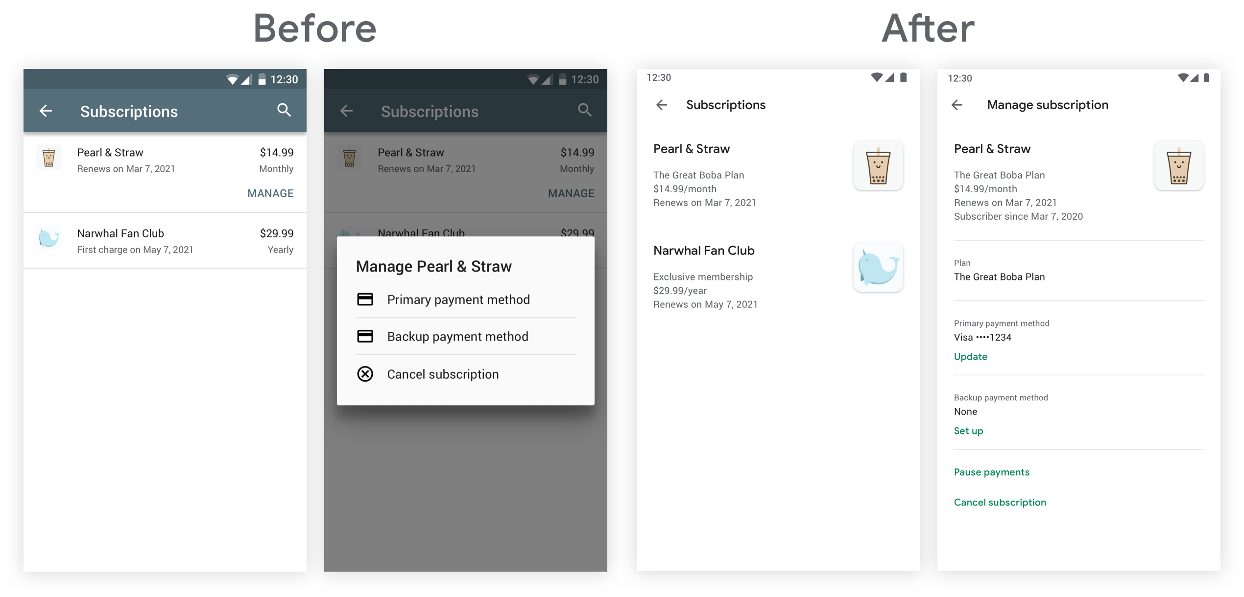
A common user complaint we heard was that it wasn’t obvious that Google Play was managing their subscription billing. When it came time to cancel a subscription, some users would get frustrated searching for the “cancel” button. We believed that helping users manage, and even cancel, their subscriptions easily was the right thing to do.
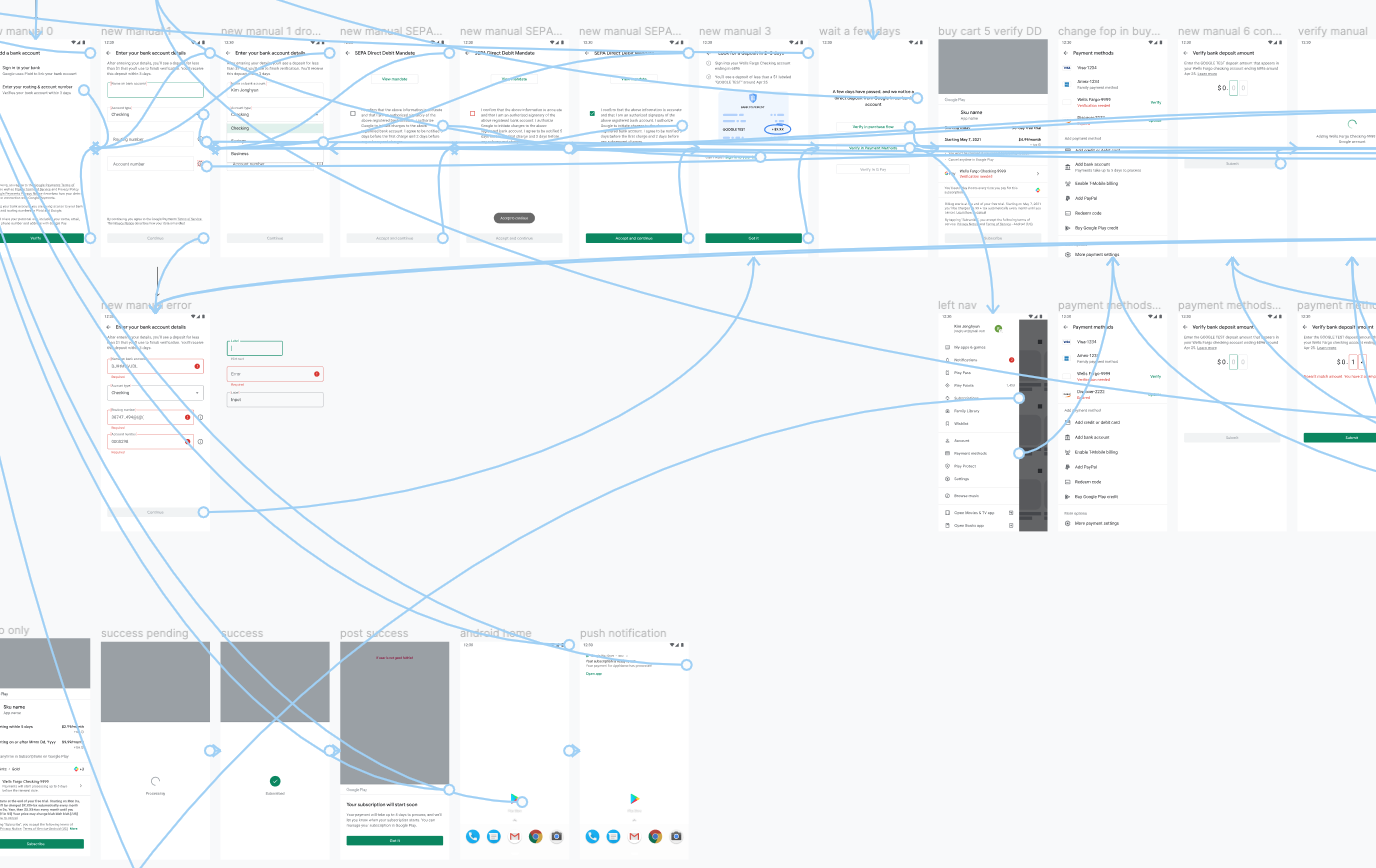
First, we decided to make the Subscriptions page easier to reach by putting it directly in the left menu. (Previously, it was tucked away as a section in another page)
"Making it just as easy for consumers to get out of their subscriptions as it is to sign up is a good business practice, and could boost subscription sign-ups overall, which benefits developers. When consumers aren’t afraid they’ll forget or not be able to find the cancellation options later on, they’re more likely to give subscriptions a try."
—TechCrunch
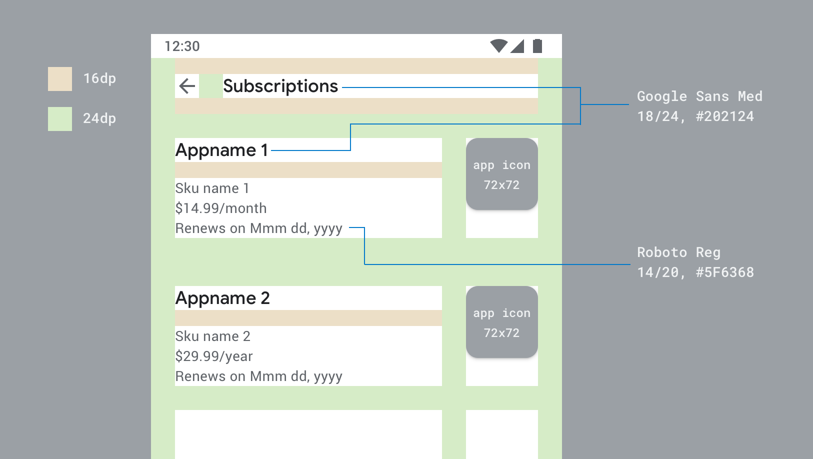
UI Redesign
The look & feel of the previous Subscriptions page was outdated. We needed a new, fresh design to:
- Align better with subscriber expectations
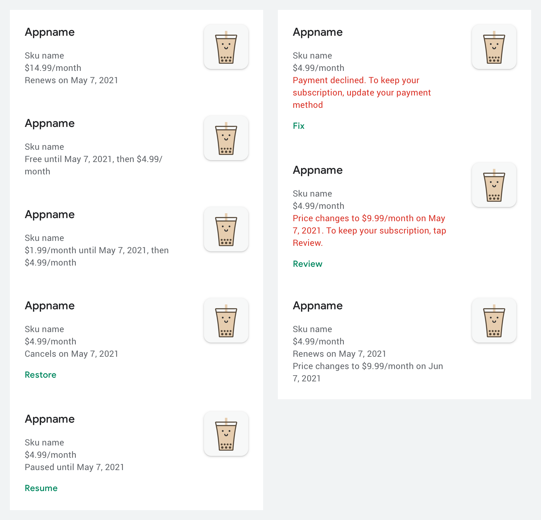
- Display a variety of subscription structures, states, and errors
- Scale and support future subscription features
- Keep up with the rest of Google with a fresh design
Help developers help subscribers
After launching the new Subscriptions page, we also crafted a simple survey that subscribers can fill out when they decide to cancel a subscription. This new Cancellation Survey gives subscribers a way to send feedback directly to the creators, while respecting their privacy and security.
Pause a subscription
A lot of churn from subscriptions is voluntary. The team hypothesized that giving users an option to pause their subscription may be an attractive alternative to canceling.
Challenges
- Determine the best way to implement a pause in billing for all our subscription period variants, including weekly, monthly, quarterly, biannual, and annual subscriptions
- Notify end users in a timely manner whenever a pause is scheduled and about to end
- Find a way to educate users who are about to cancel their subscription that an alternate solution exists
Process
- Explored 4+ ways to pause, and eventually aligned with product team that subscriptions would pause at the end of the current billing period
- 20+ mobile UI design iterations, including different ways to initiate, edit, undo, and end a pause early
- Created email templates for 3 moments we’ve determined that users need alerts or reminders about a pause they’ve scheduled
- Duration from project kickoff to design delivered: 11 months
Backup payment method
There was large user interest in being able to set up a backup form of payment, in case something goes wrong with their primary form of payment. Our goal was to make Play subscriptions more reliable by decreasing payment failures.
Challenges
- Collaborate with teams across the Google organization who were closer to the payments infrastructure
- Communicate to end-users about the limitations involved, such as which types of payment methods are ineligible
- How would we communicate to users when their backup payment method was utilized?
Process
- Explored 20+ designs for payment method selection, deselection, and payment failure UI indicators
- Detailed documentation of all critical user journeys
- Duration from project kickoff to design delivered: 7 months
- After first launch, revisited the project and designed a smarter way for Google Play to “suggest” a payment method instead of always asking users to select from a list
Direct debit payment method
In many parts of the world, bank transfers are a popular way to pay for goods & services, and we wanted to bring this new type of payment method to Google Play. However, it came with challenges. The team felt that subscriptions was a good first step to introduce direct debit because the process can feel more seamless with free trials, and subscription entitlements were easier to manage compared to one-time microtransactions.
Challenges
- Adding & paying with direct debit takes several days to verify. How can we accurately communicate expectations to users?
- How can we be thorough about what’s happening to a user’s money?
- Collaborate with teams across the Google organization who were closer to the payments infrastructure
- Alignment with external payment partners whose services Google uses
Process
- Created several flowcharts outlining the user’s experience depending on if the several-days-long pending charge was successful or resulted in a failure
- Pushed for simplicity and delight in what otherwise was a long and tedious user flow
- Design documentation for how direct debit behaves with each of our 12 types of subscriptions states & variants
- Close partnership with UX Writing in countless rounds of copy iterations, trying to convey complex payment states in very limited real estate
- Duration from project kickoff to design delivered: 6 months
What I learned
After several years working on Google Play Commerce & Monetization, and having the privilege to work with every product manager in the department, I felt like my understanding of UX Design was stretched in good ways. The Google Play billing platform is probably one of the most complex user-facing billing systems in the world, and it was an honor for me to be a part in shaping the user experience.