Zendesk billing UX
If you sell stuff, then you need customer support
Zendesk builds beautifully simple customer support software to strengthen relationships between businesses and their customers.
Make checkout better
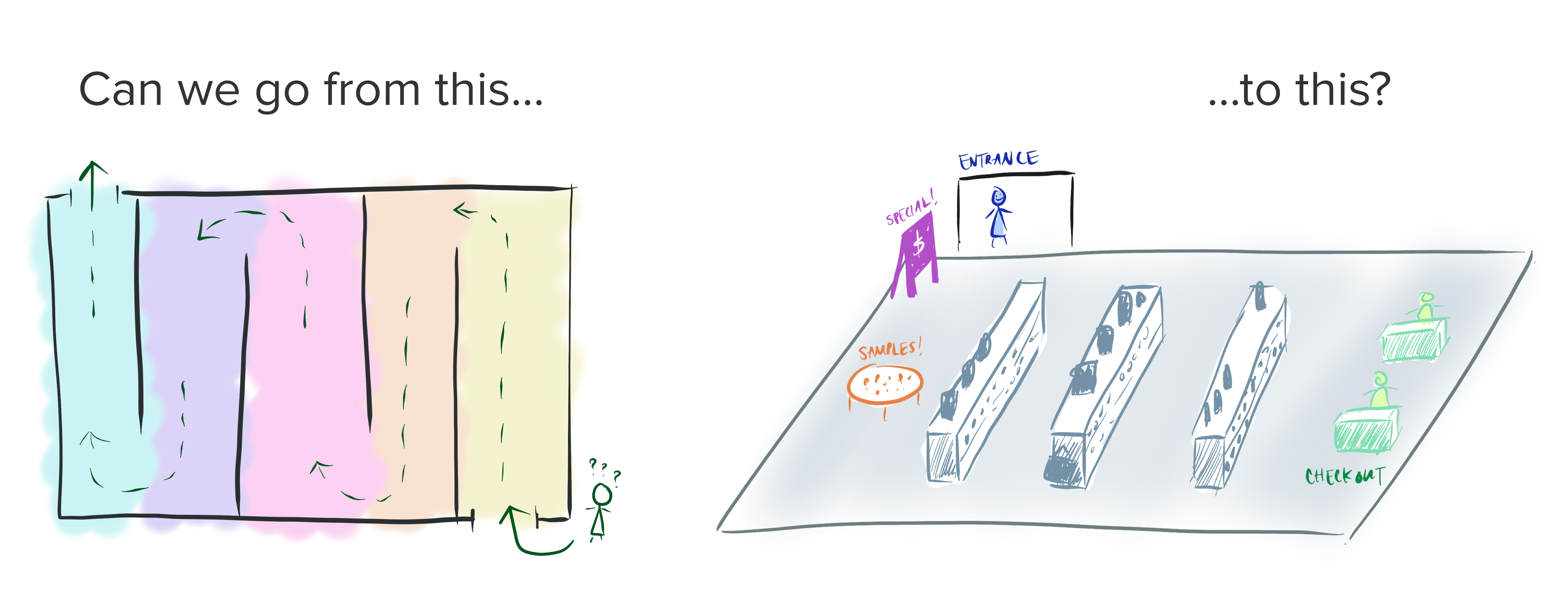
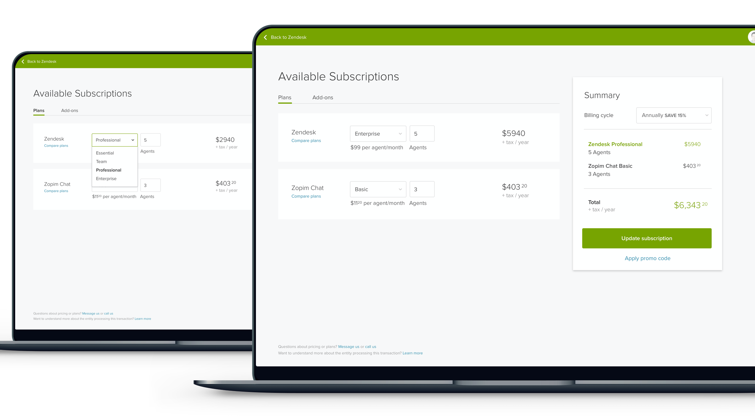
Back in 2015, the checkout experience was similar to browsing a museum gallery—users had to step through each product page and add items to their cart one-by-one. With Zendesk’s growing product suite, we knew something needed to change, or very soon we’d have a dozen-step checkout flow. What we needed was a supermarket approach, where users could select the products of their choice, and finish the purchase more efficiently.
First, let’s brainstorm
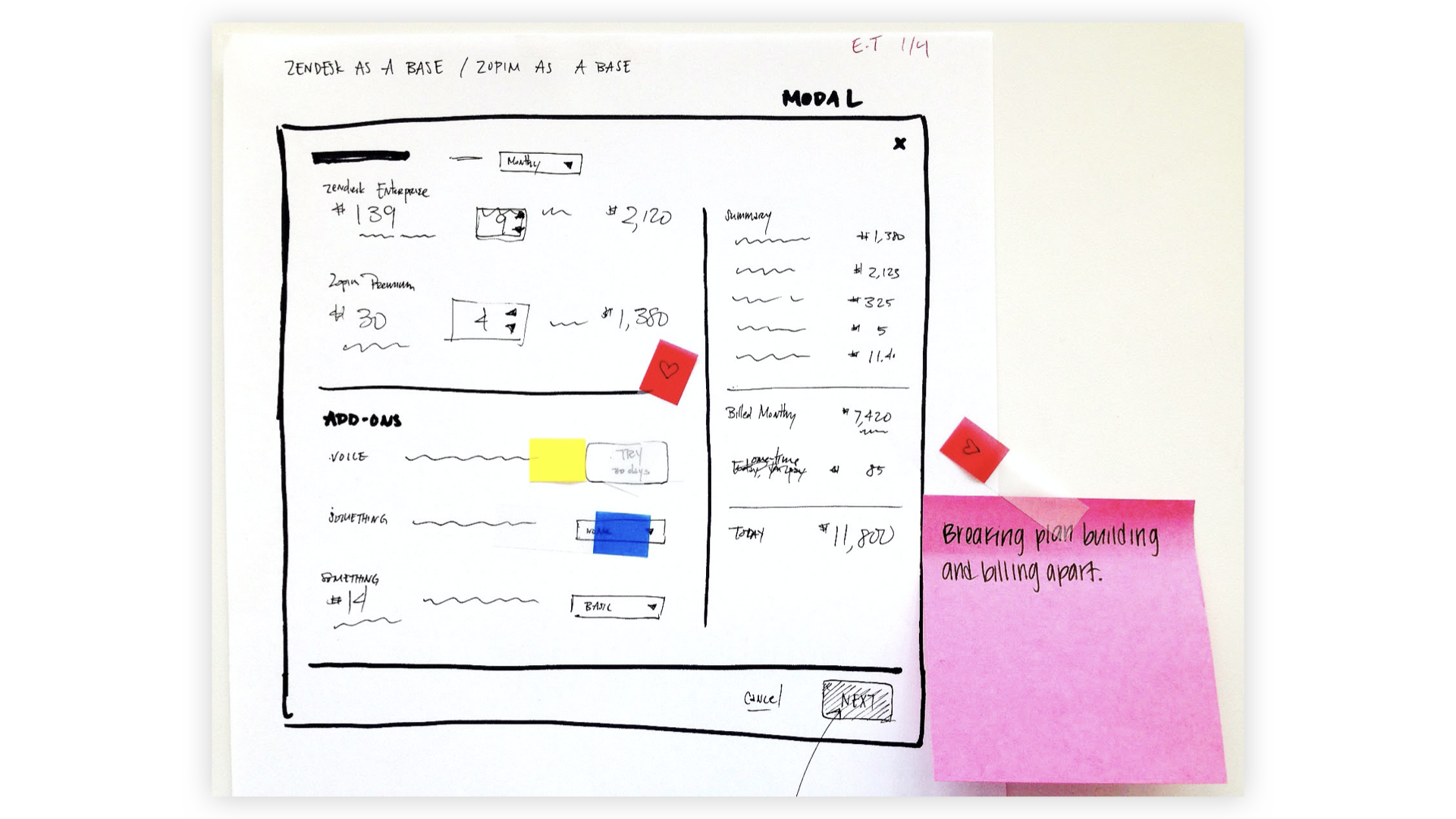
At the same time, our SKUs and pricings were going through a restructuring. Together with the entire product team, we spent a full day brainstorming different ways to design a great billing experience that could propel our business and make our customers happier.
UX challenges
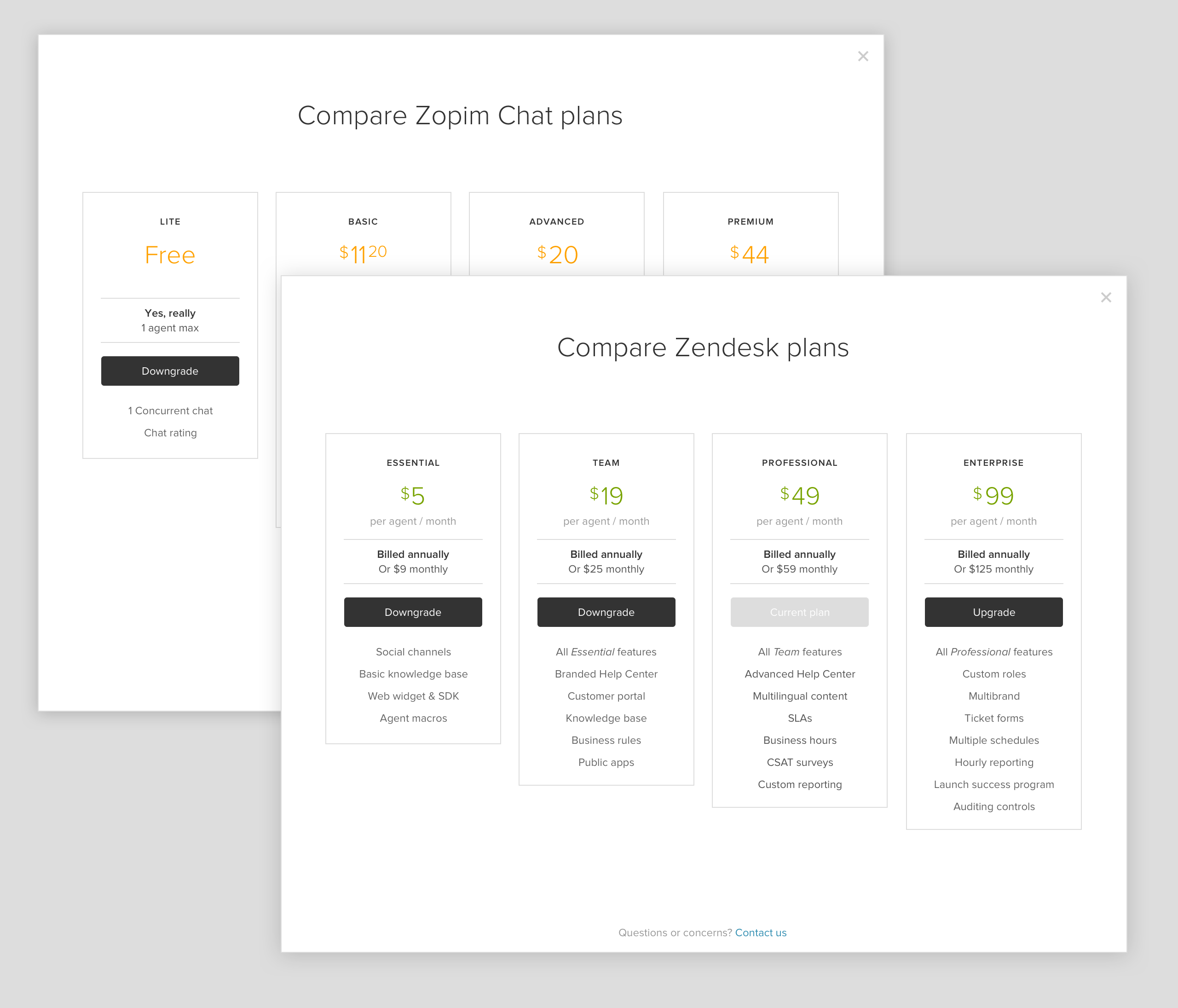
- Mapping out upgrade & downgrade paths between all our SKUs
- Comprehensive edge & corner cases for discounted and special SKUs
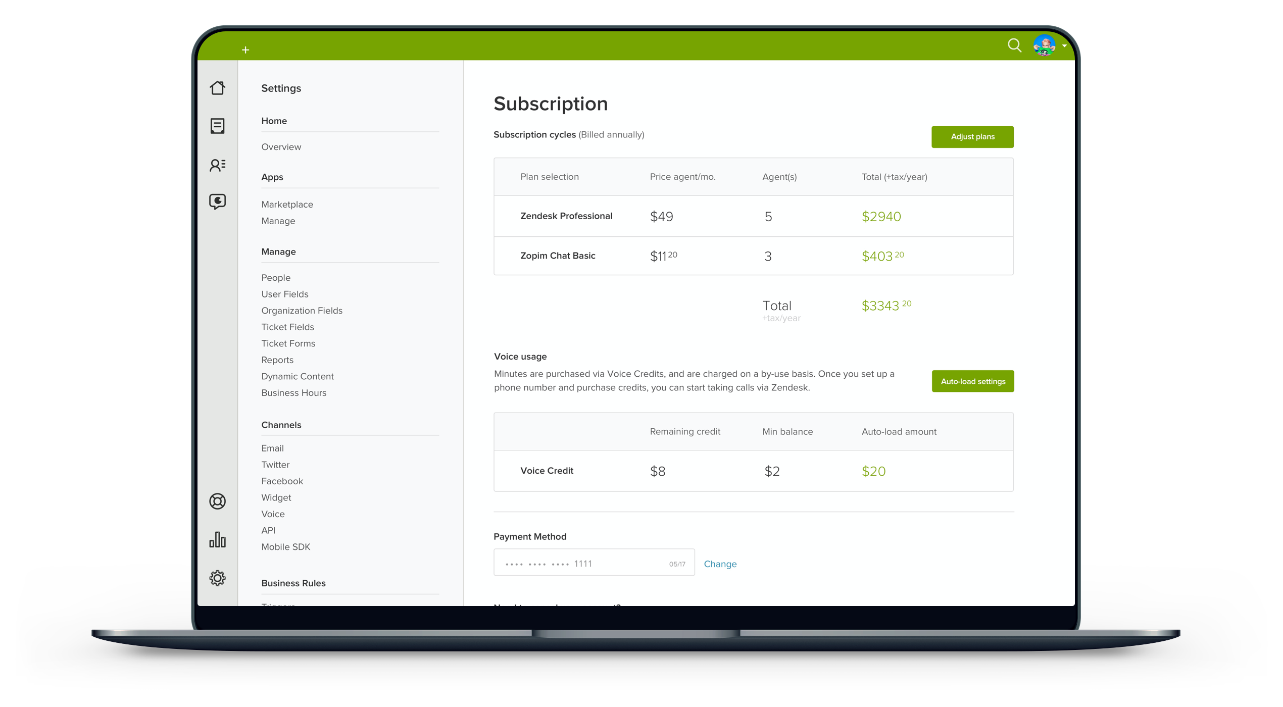
- Make the pricing easy to understand, while still including payment details such as price per seat, price per billing cycle, add-ons, tax, VAT, billing terms & disclosures
- Future-proofing: crafting a plan to incorporate billing for future products
- Helping new customers feel delighted about making their first purchase
- Detailed documentation so the next designer would not drown in details like I did at first
Make onboarding better
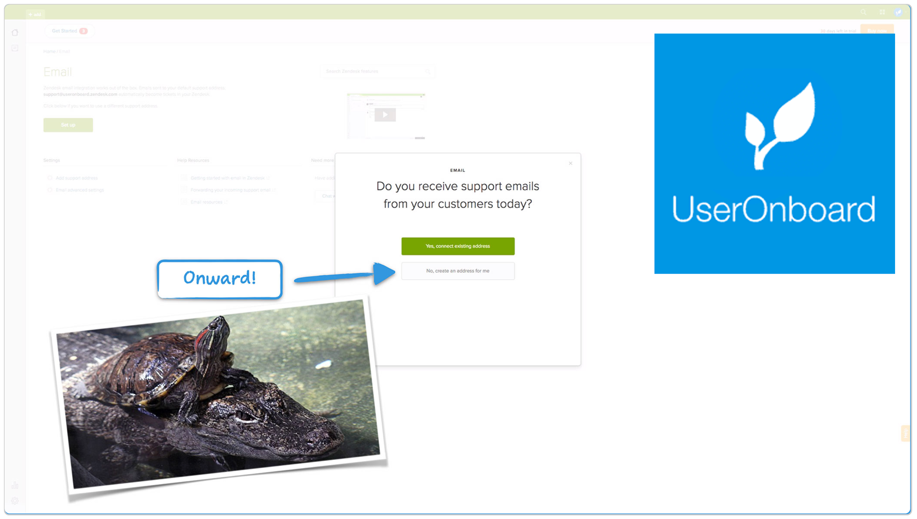
Meanwhile, I was also working on making Zendesk easier to understand for first-time users. Many users complained that Zendesk was too hard to learn and set up, so we brainstormed a few ways to make email setup as seamless as possible.
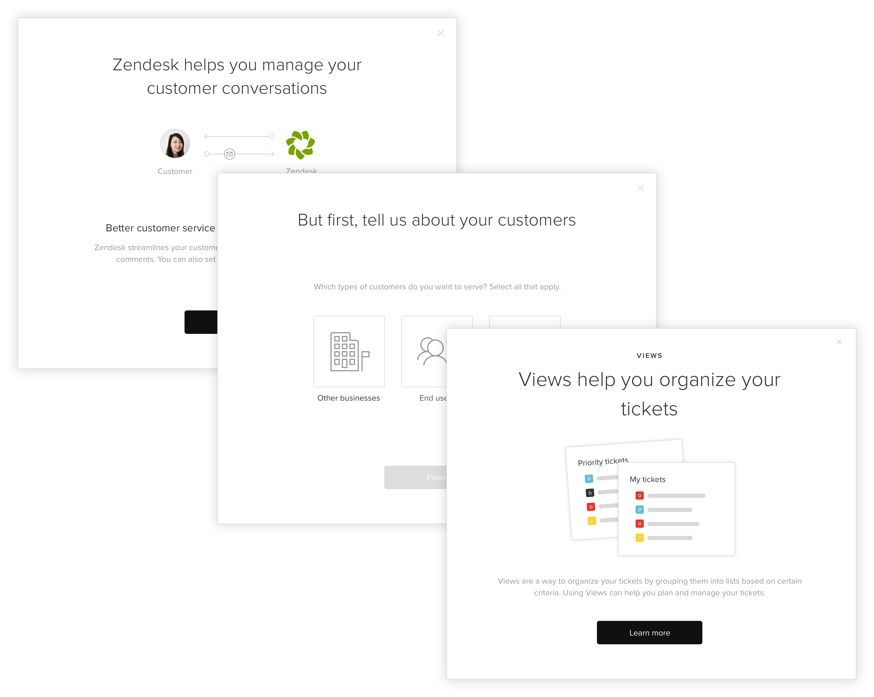
Check out UserOnboard's teardown of the Zendesk onboarding flow in 2016. (Felt surreal to see my work on a website that I admire!)
